Cigar Bands
Über Bauchbinden habe ich bereits mehrmals geschrieben. Eine meines Erachtens wunderschöne Kunstform, wie dieses Beispiel zeigt:

(Quelle: Bauchbinden-Museum)
Smoke Magazin Online bringt nun eine ausführliche Story (in Englisch) über die Tradition und vor allem über die wichtige Rolle, die Bauchbinden (Cigar Bands) bei der Etablierung von neuen Brands einnehmen.

(Quelle: Smoke Magazin Online)
Strike up the BANDS
Creating cigar bands has become not only an outlet for artistry, but also a vital component in the process of establishing new brands and revitalizing old ones.
By Mark Bernardo
The origin of the cigar band as we know it today can be traced back to 1854 and an enterprising cigar maker named Gustave Antoine Bock. As the legend goes, upon one day inspecting a box of cigars from his factory, Bock was beside himself when he discovered that someone had replaced a cigar within with one of inferior quality. Then and there, he decided that identifying each cigar with a personalized band was the only way to ensure brand identification and hence, commercial success. The idea was quickly adopted throughout Cuba’s cigar factories, and by 1884 was considered an essential component of the cigar making business.
The period between the 1890s and World War I was widely considered to be the Golden Age of cigar band production, with advances in printing, color, and lithography turned to the task of creating ornate, artistic masterpieces suited to the popular vanity that cigar smoking had become. Bands featured portraits of kings, presidents, popes, and other personages of grandeur, as well as animals, plants, coats of arms, and nationalist symbols like the American bald eagle and British lion. Fast-forward about 100 years, and many collectors of this unique art form will notice a change – and the beginning of a new era of cigar band design.
One of those collectors, it turns out, is also one of the pioneers of this new age. “There was something about the old labels and packaging that really fascinated me,” recalls Carlos Fuente, Jr., describing the thought processes that led him to commission the now-famous band for his now-legendary Fuente Fuente Opus X cigar. “I was very frustrated that that look had been lost; by the 1970s it seemed impossible to print bands with gold bronze and those great designs. Everything was simple. I wanted to recapture the past.” The Opus X band is indeed a nod to the gilded, festive bands of yesteryear, with its blazing red “X,” gold adornments, die-cut shapes, and sheer width that makes an Opus X smoker visible across the room. It also became, as Fuente puts it, “the godfather of all these new bands” – that is to say, the inspiration for the burst of creativity that hit the industry almost simultaneously with the 1990s cigar boom and continues today. And while the idea behind the band could be considered retro, even historical, the technical expertise it displays also marks it as decidedly a product of the modern era. “These bands took almost two years,” Fuente proudly reports. “People in the 1800s did not spend that amount of time to make a band. It was designed based on the past, but it’s so different people think it’s modern.”
Extremely retro, ultra-modern, and retro-mixed-with-modern are the three major categories in which most of today’s best cigar bands fall. And for every cigar maker, like Fuente, whose mission is to celebrate the past and tradition, there is also one who views breaking the long-established rules and flouting conventions as his main inspiration. “Blue is not a color that is traditionally associated with cigar bands,” reveals Brian Ganton, Jr. of Brian J. Ganton & Associates, the design firm responsible for the look of one of the most successful cigar launches in recent years, Helix. Ganton refers to the long-standing, unwritten law (confirmed in a separate interview with Helix’s new corporate parents, General Cigar, Inc.) that blue bands simply could not look good on cigar wrappers. But the Helix brand was itself such a gamble – a defiantly mild cigar trying to crack into a market filled with full-bodied powerhouses, and going up against mighty Macanudo, the mild category’s unquestioned leader – that Ganton figured, why not roll the dice? “It was a risky strategy,” he admits, “but we knew the type of person we were speaking to with this brand. The metallic quality, the fade, the thrusting character of that ‘H’ monogram – it had a modern, almost ‘virtual’ look – like those cool colors that Apple uses in their [iMac] computers.” Helix has since pushed the color envelope even further, using a bright purple version of the band for their maduro line.
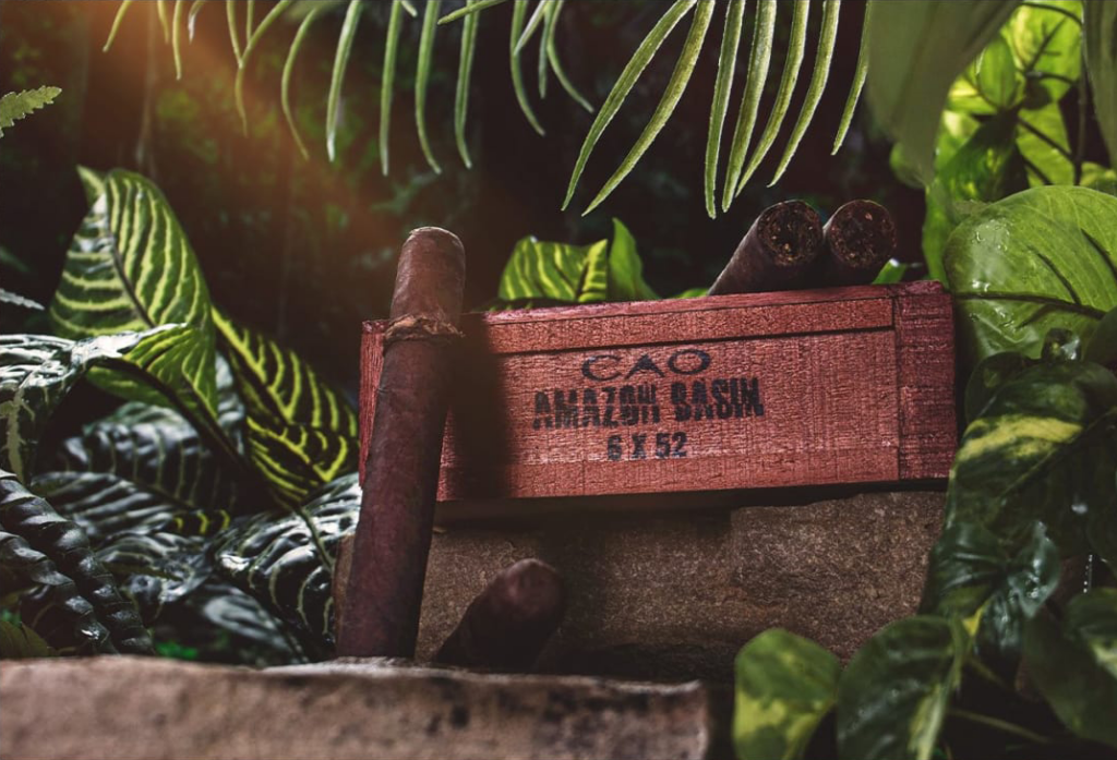
In the case of Helix, the cigar’s name determined the direction of the design. Sometimes, albeit rarely, it works the other way around, with an eye-catching design actually inspiring the brand name and motif. One of those rare cases is the C.A.O. Brazilia, which was unnamed until company president Tim Ozgener noticed a bit of aesthetic serendipity. “The CAO logo is a vertical diamond,” he points out, “and if you turn it horizontally, it matched almost to a T the diamond on the Brazilian flag. We had a cigar sample we liked with Brazilian wrapper on it, and we just thought, this is perfect; why don’t we incorporate this into the design of a band and a box? It’s a beautiful flag and it represents the vibrancy of the country of Brazil.” Despite the prevailing wisdom that Brazilian tobacco “doesn’t sell,” Ozgener forged ahead with emphasizing the new brand’s Brazilian character, right down to the “made by hand” notation on the band in Portuguese (in place of the traditional Spanish “hecho a mano”).
Cigar bands, obviously, are primarily intended to sell cigars – but occasionally they are recognized for their artistry outside the insular world of cigar band collectors. The elegant Avo band, designed for the brand’s namesake, jazz pianist Avo Uvezian, by the graphic designer Darrel Ireland, won second overall prize in a European graphic design competition. One of the most recognizable bands among connoisseurs in its various color schemes, it sports a stylized logo with interlocking letters – but, it turns out, not quite the letters most people think. According to Avo himself, who approved the design, “that ring in the background is not actually an ‘O’ and that ‘V’ is actually a Latin ‘U.’ It’s a very clever design – classic and simple, yet different than any other brand.” So now it can be told: the Avo cigar logo is not A-V-O, but A-U – for Avo Uvezian – with a round background element. The image is also used, in a distinctive color scheme, for the Avo Cigar Lounge, and the special cigar served there, which points out another vital component of today’s cigar bands: staying power. Asked if any brand extensions might ever sport a re-worked design, Avo responds, “We would never change the design of the Avo band. The comments I’ve gotten in shops all over the country and across the world seem to indicate that people love it the way it is.”
Longevity and recognition like Avo’s – or those of the long-established Cuban-pedigreed brands – have to start somewhere, and many cigar companies are devoting more creativity than ever in establishing a cigar’s “look.” The process of designing a cigar band has come a long way from Gustave Bock’s day, and depending on the size of the company, the budget, and the amount of input by the cigar’s proprietor, it can be as involved and expensive an undertaking as any other product launch. Take the case of the recently-introduced Diablo line from General Cigar. After determining little else but the name and tagline “Tabacos Picantes,” General brought in Sven Mohr, the versatile designer from Copenhagen, Denmark who had developed advertising campaigns for the company’s Punch and La Gloria Cubana brands, to tackle the challenge of visually establishing the first new cigar line from General in many years. And as Mohr points to some early, rejected versions on a chart tracking the brand’s design evolution, one gets a sense of the trial and error involved.
“The ones with the ‘sun’ icon were killed off early on; it sent the wrong signal,” Mohr explains. “We’re not talking about a ‘hot’ cigar here, but a ‘spicy’ one. Then we went to the devil icons – pentagrams, actual devil figures. We couldn’t agree on what it should look like – cartoony or scary, et cetera – so we collectively agreed not to go there either. The word Diablo itself could bring that point across. So instead I tried to find an icon to get across the ‘picante’ idea.”
Hence the decorative “pepper” element that ultimately determined both the curve of the Diablo logo and the shape of the band. “We tried some straight-sided, more modern bands,” Mohr says, “but they competed with the shape of the logo. The band looked cramped.” Designing the box usually goes hand-in-hand with the band, and presents a unique challenge. “It’s really hard to build a brand from nothing,” stresses Cooper Gardiner, VP of Marketing for General Cigar. “Without that built-in equity of the name – like Partagas, Macanudo, Punch – the chances of success become smaller. A lot of it comes down to how the packaging looks in a store’s humidor. Colors have to catch your eye.” Hence the glimmering, raised, red lettering on the sleek, black Diablo box that echoes the embossed red foil on the cigar bands. You might say that a customer would have a devil of a time missing either on the shelf of their local tobacconist.
Most cigar makers would agree – those shelves are probably more colorful and eye-catching than they’ve ever been. Whether it’s a look of ornate extravagance (Diamond Crown Maximus, Alec Bradley Pryme, La Aroma de Cuba), classic simplicity (Padron, Camacho, Montecristo, Dunhill); cutting-edge modernity (Helix, ACID, OneOff), or some combination of two or more, there seems to be room for all styles in today’s cigar market – matching the array of tastes and strength levels demanded by today’s cigar enthusiast. Partly a result of the fierce competition for a smaller market since the cigar boom, partly a consequence of advances in technology, partly a sign of the cigar business making ever larger strides into the arena of graphic design excellence, we are seeing something of a visual renaissance – surely, a pleasant side effect of this modern era of quality cigar making.